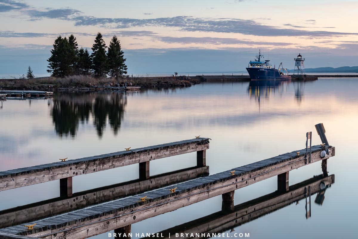
The research vessel Kiyi comes to Grand Marais only a few times a year. It usually stays one day before it ships back out onto the big lake. On this visit, the sky had interesting clouds and the crisp, early-spring air kept the haze from forming over Lake Superior like it does as the temps rise. I wanted to make sure to get the exact right composition and to do so I made small changes in the photographic composition to make the photo I wanted. It was about maintaining balance and developing fit.
Maintaining Balance
To understand balance in photography, you have to understand visual weight. Visual weight is a part of the photo that attracts your attention. When looking at a photo, if your attention goes to a visual element first, it has a lot of weight. If it goes there second, it has less weight. If it doesn’t go there, it doesn’t have any weight. Typically, bright areas have lots of weight, areas of movement have lots of weight (diagonal lines), sharp areas have lots of weight, contrasty areas have lots of weight, humans and animals have lots of weight, man-made objects have lots of weight. Areas that are out-of-focus have little weight and dark areas have little weight.
If you divide a photo right down the middle so you have a left and right side and put an equal amount of visual weight on each side, you create balance. For me, balance is important to make images the way I like to make them. When balanced, the image frees your eyes and allows your eyes to wander confined only by the flow the photographer worked into the image.
Developing Fit
Fit is a compositional technique that is similar to putting together pieces of a puzzle. You take the elements in your shot and arrange them so that they fit together. Sometimes, they will nestle together closely and sometimes they will make the suggestion of fit. In my work I don’t use this all the time. But, when it works, it really ties the image together. It does this by creating a visual relationship — a strong connection — between the elements that you fit together.
Small Changes
In this image, I made minor modifications to my composition after each shot until I finally arrived at the arrangement that not only balanced the shot but added some implied fit. To see the changes, you may have to click on an image and click through each one. This will demonstrate the process as each new image replaces the prior.
Image 1: This was close. I like the dock and the Kiyi and the clouds, but there is too much weight on the left side of the image. You can see the gap on the right that has nothing in it. That is wasted space.
Image 2: I rotated the camera slightly to move the docks more to the right.
Image 3: The cloud in the sky was reflecting a diagonal in the water that was similar to the dock, so I tilted the camera up slightly to get the entire cloud in the shot.
Image 4: The image still felt unbalance, so I move the tripod to the left slightly. This moved the dock almost completely to the right. It kept the diagonal cloud. And, the Kiyi and Lighthouse now fit into the opening between the two docks creating an implied fit. This was my final shot. I missed the best color, which occurred in image 3, but the composition is better. The better composition made the shot better in my mind, so it is the one that I would show. It was also later, so the lighthouse light came one and the lights on the ship show better.
On of the biggest mistakes I see on my photography workshops is when a participant has developed the almost perfect balance but just misses. That miss is similar to what you see in the first couple of shots. One side will have just a sliver of either too much weight or not enough; that is usually enough to throw the entire balance off. When making a composition get everything to the point where it looks perfect. After that look at the extreme sides and figure out if something is amiss at the edges. If it is, usually a small rotation of your camera or a slight sideways shuffle of the tripod will fix it.


Leave a Reply